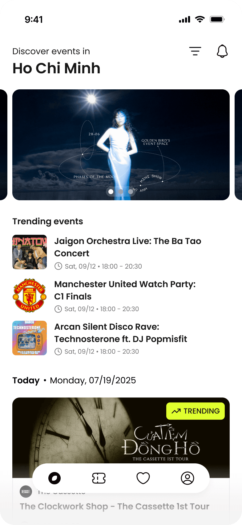
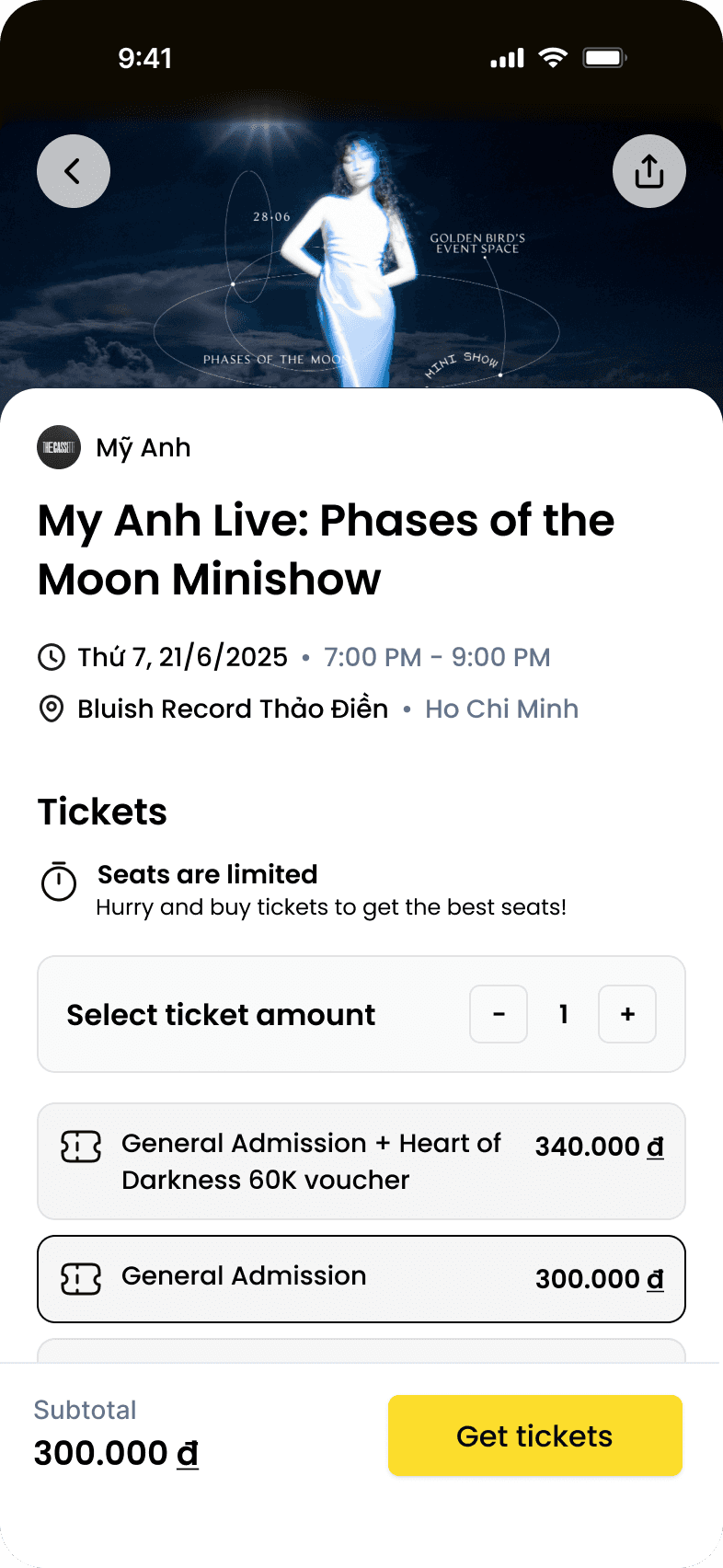
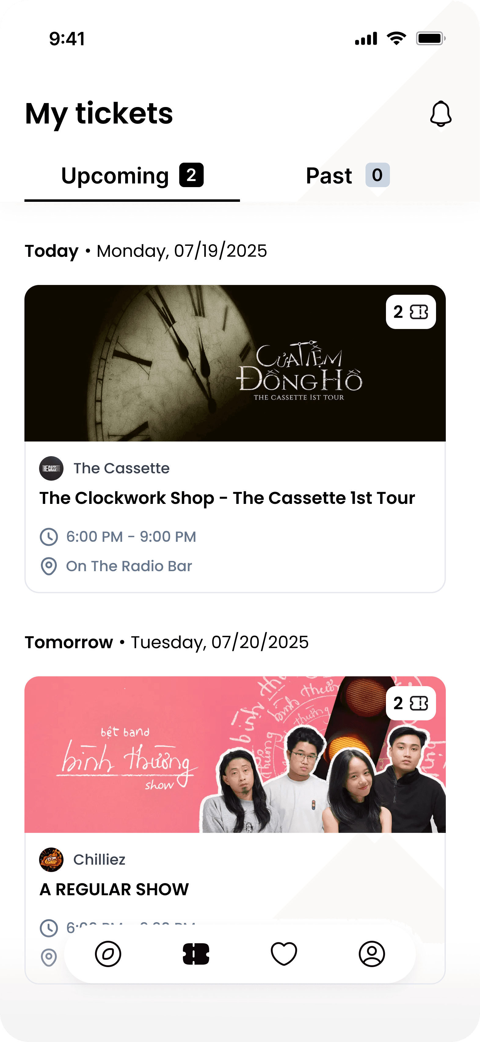
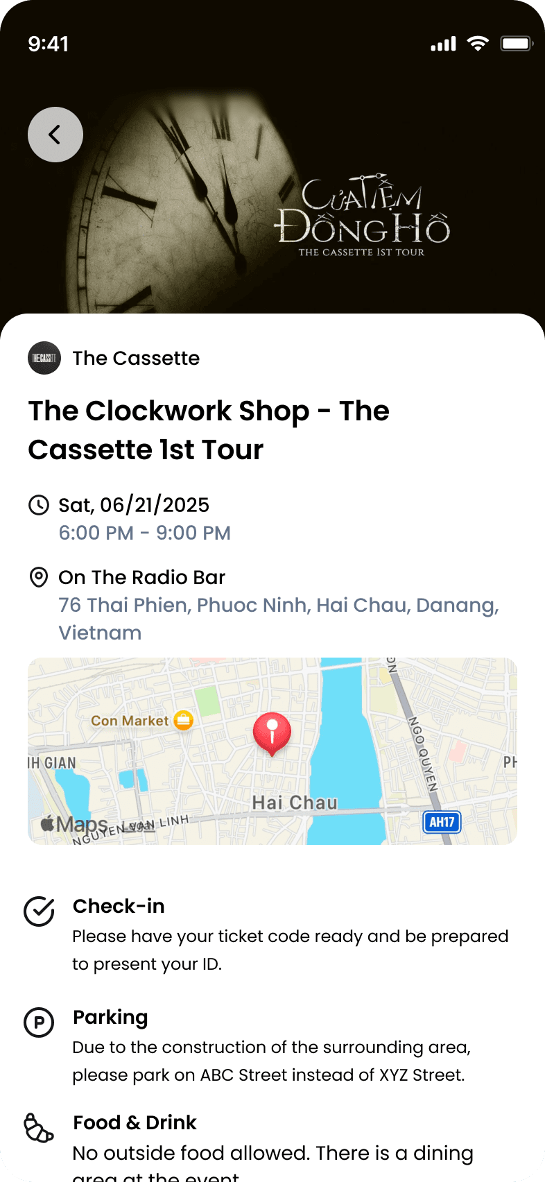
01
Flip
Project Overview
Vietnamese users expect to see the full picture before they commit — stripping information to fit a 'clean' Western mobile layout feels incomplete and untrustworthy. That tension between global UX conventions and local trust patterns shaped every design decision I made on Flip's native mobile app, from event detail pages to the ticket purchase and check-in flows.
I worked with 2 other design interns and a small dev team over 12 weeks, leading the check-in experience in Phase 1 and owning the general purchase and discovery flow in Phase 2.
Role
UI/UX Design Intern
Skills
Visual Design
UI & UX Design
UX Research
Timeline
June - September 2025
(3 months)
Team
Founder/PM · 3 Developers
· 3 Design Interns
background & SCOPE
Modernizing Vietnam's ticketing: The Flip mobile app
Flip.vn is an innovative ticketing platform, designed to modernize event ticketing for organizers and consumers by emphasizing automation, transparency, and event-specific tech.
Building on its existing web platform, this co-op project aimed to expand into a full native mobile app, with 2 phases:
Phase 1: seamless check-ins and notifications
Phase 2: event discovery, ticket purchasing, and queueing.

The problem
Fans Struggle to Discover and Secure Tickets in a Cluttered Market
goals
Flip Wants a Native Mobile Solution That is
Research
Outdated Ticketing Technology Hinders Vietnamese Event-going Experience
To understand users’ frustrations with ticket handling and check-in processes, I conducted 3 user interviews and analyzed 2 major Vietnamese platforms (Ticketbox and Cticket), alongside US counterparts like Ticketmaster, Seatgeek, and Luma.
🔍 Finding 1
🔍 Finding 2
🔍 Finding 3
Competitor Insight & market research
Designing for Vietnam, not just for mobile
Adapting Flip for mobile wasn't just a technical translation, it required understanding what Vietnamese event-goers actually expect from a ticketing screen, which is meaningfully different from Western conventions.
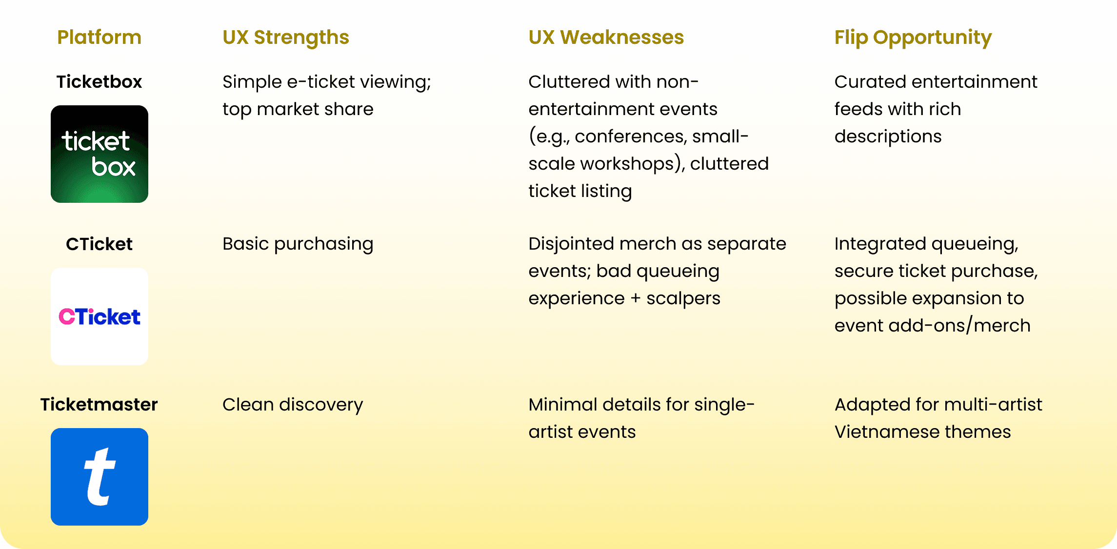
I conducted a comparative analysis of major Vietnamese platforms and international ones to identify what makes event discovery feel intuitive, enjoyable, and trustworthy.
I led a comprehensive competitive analysis on 🇻🇳 Vietnamese and 🌍 international platforms
one thing that matters...
Culture Context! Localization!
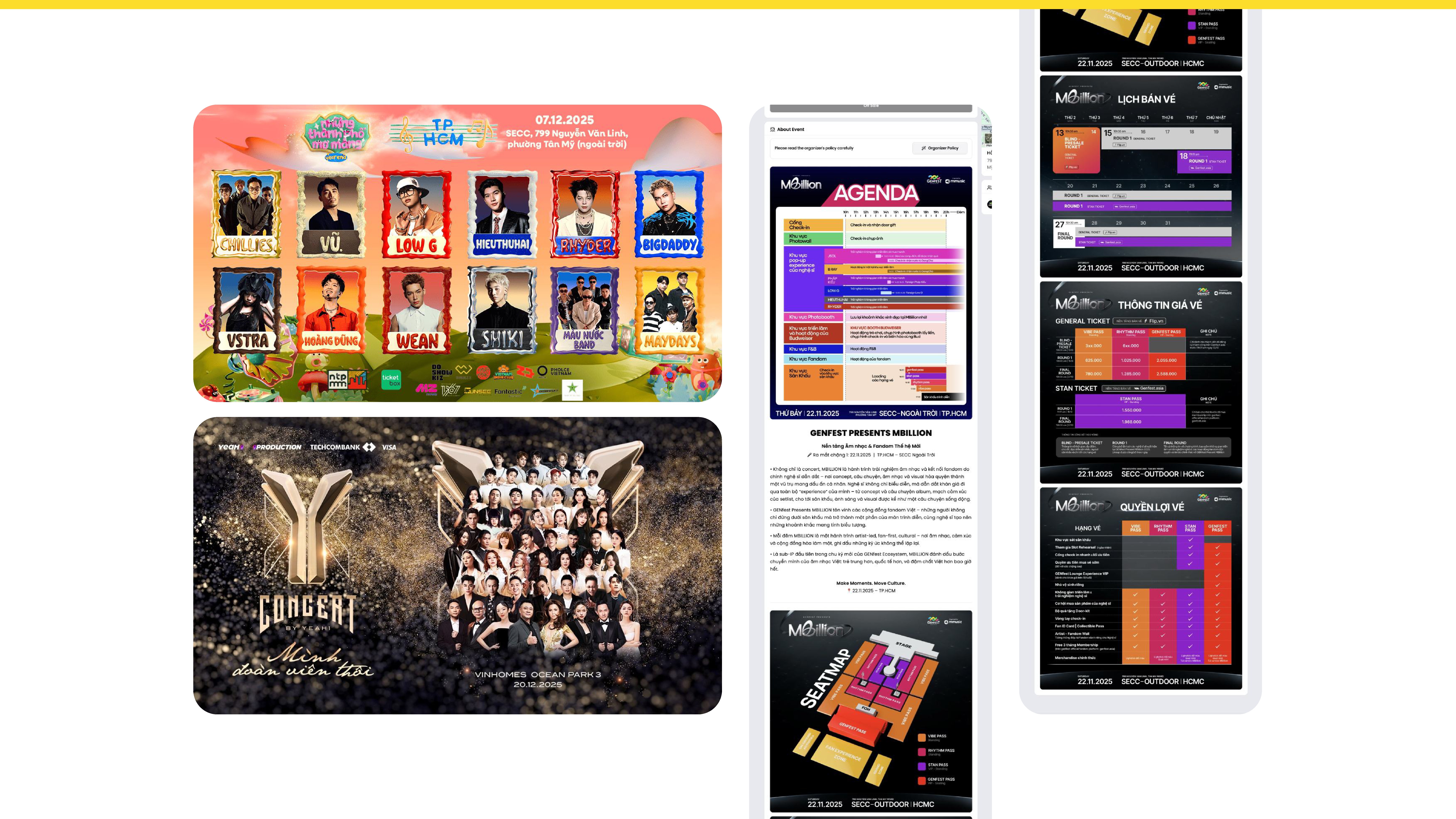
Similar to other Asian countries, Vietnamese users have a preference for information-rich apps. A US ticketing app like Ticketmaster leads with the purchase CTA. Vietnamese users expect the full picture (event name, time, location, organizer info, pricing range, accessibility notes) before they're asked to commit. Stripping that information to fit a "clean" mobile layout would have felt incomplete and untrustworthy to the target audience.
Curious why?
The context-heavy nature of Asian countries where users want the most information available to them as possible? Vietnam is no exclusion.
To add a video to your site, click the “Insert” button and navigate to the “Media” section. Then, drag and drop a video component onto the Canvas.
To add a video to your site, click the “Insert” button and navigate to the “Media” section. Then, drag and drop a video component onto the Canvas.
However, this highlights risks of clutter leading to poor UX.
Flip's main competitor, Ticketbox, has a dense UI that distracts users, while often feels outdated and inconsiderate.
opportunity space
Postioning Flip as the Event Discovery Platform for Vietnamese Youth
This challenge revealed Flip's unique positioning. The Vietnamese youth culture has one foot in tradition (detailed, context-rich information), and one foot in the future (clean, scannable interfaces).
Instead of choosing sides, we designed Flip to deliver both.
decisions & iterations
making flip mobile
📍 Explore events
A Location-based Explore Page that Allows Personalization
📍 ticket purchase & queueing
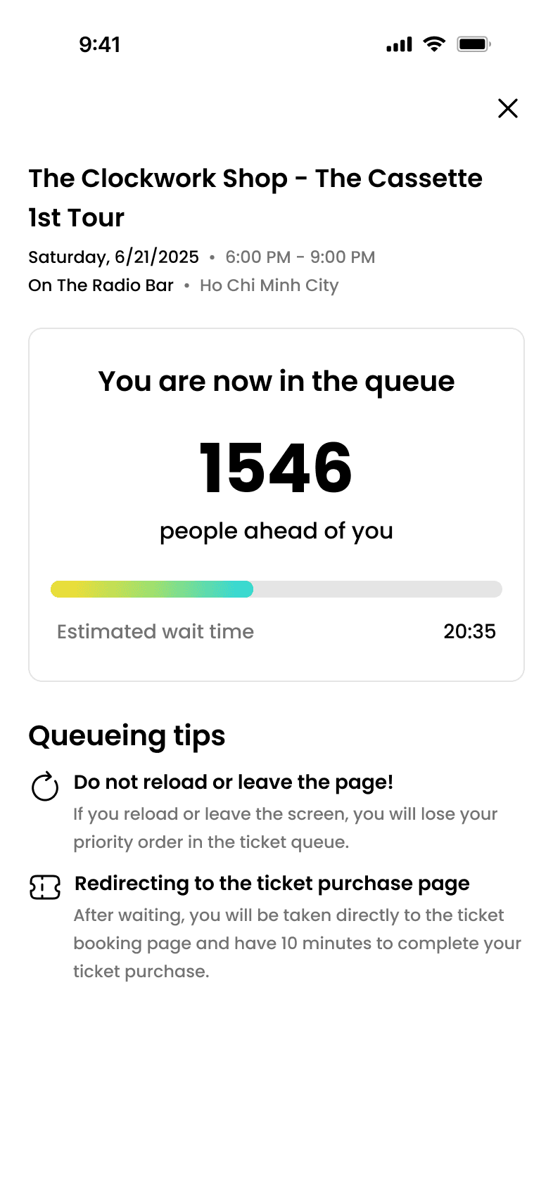
End-to-end Purchasing Flow Facilitating Queueing & Culture Context

📍 accessing tickets
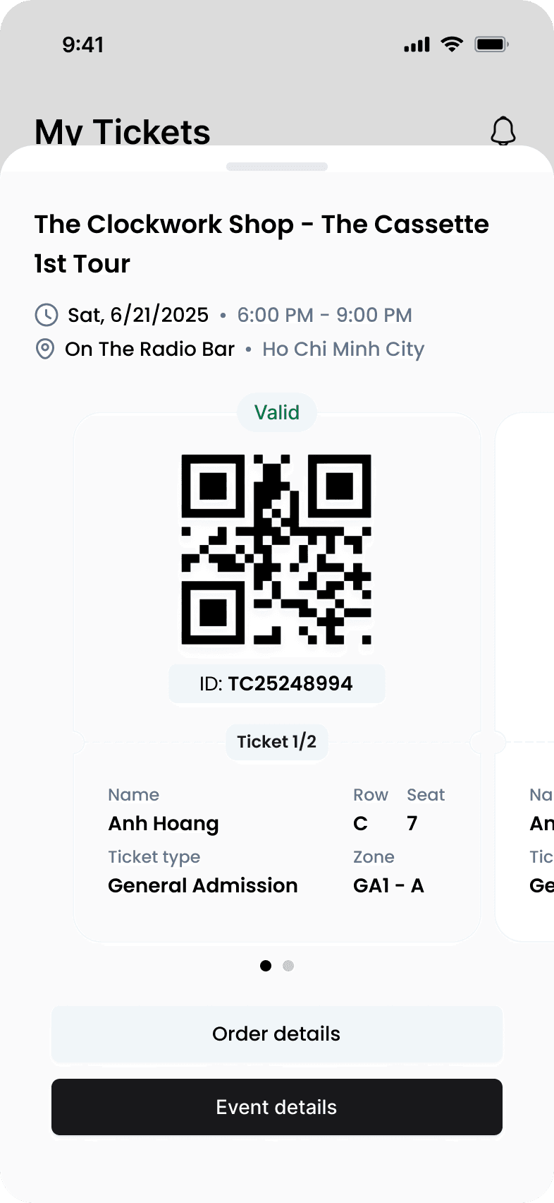
Allow Secure Offline-accessible Tickets In-app
📍 event details post-purchase
Display All Necessary Information in the Event Details Page
📍 notification
Notifications for Real-time Event Updates
final product
The Flip Native Mobile Experience
The full native app extends to pre-event experiences, offering curated event discovery, fast purchasing, and fair queueing.
Features
Unique to Flip
Reflections & Next Steps
Moving fast & Looking back
Working on Flip’s mobile app deepened my understanding of designing for cultural and technical constraints in a startup environment.
Carrying out research under a 4-week Phase 1 crunch taught me to prioritize competitor and market insights, especially for Vietnam’s unique needs (e.g., network-unstable venues, info-dense preferences). Adapting the inherited web design system for mobile honed my skills in balancing consistency with innovation, while Phase 2 emphasized the importance of thorough planning and collaboration in prototyping a full-blown, detailed user flow.
If I had more time, I’d conduct deeper user research for Phase 2 and more user testing to validate Phase 2’s full mobile flows.
This project solidified a principle I keep coming back to: good UX isn't universal, it's contextual. The information density that would feel cluttered in a US app was exactly what built trust for Vietnamese users, and I wouldn't have learned that from a pattern library. It came from interviews, competitor analysis, and being willing to push back on my own instincts about 'clean' design.
